

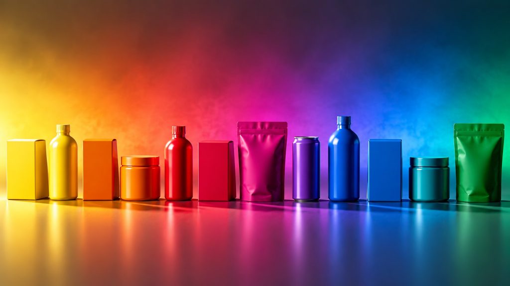
Product personality begins with the eyes.
By: Iván H. Rodríguez B.
Director / Editor Envapack.com
Try a simple test: close your eyes and picture a red soda bottle, a blue jar of cream and a white beer can with gold details. We never named a brand, yet you already know what flavor to expect from the soda, how gentle the cream should be and whether that beer is light or strong. You did not have to read a single label. Color told you the whole story.
That is the underlying reason why color in packaging decides so much. It is not the only element that communicates, since shape, typography, texture and material do too. But it is the one that arrives first, the one that arrives fastest and the one that keeps working when nobody is explaining the product. Before shoppers know what a product is, color has already told them what it is like. That, in a nutshell, is product personality.
Packaging does not dress the product: it gives it character
For a long time, packaging was thought of as a wrapper that contains, protects and preserves. That function is still essential, but it falls short. Packaging is the medium closest to the consumer, the only one present at the exact moment of purchase that later travels home, gets opened, gets used and is seen again in the pantry. No billboard, commercial or digital ad has that kind of intimacy.
That is why we talk about product personality. As with a person, a product is perceived as serious or cheerful, natural or technical, economical or exclusive, youthful or traditional. And as with people, that impression forms in seconds and is hard to change afterward.
In that first impression, color plays the leading role. According to data cited by the packaging industry, up to 85% of the first impression a customer forms of a product is based on color alone, and color can raise brand recognition by up to 80%. The other design elements nuance, reinforce or correct. Color proposes.
Buying with the eyes: color as the gateway to sensory marketing
Sensory marketing starts from a very simple idea: we buy with all five senses, even though on the shelf we can only use one. Nobody tastes the cookie before paying for it or smells the detergent through the plastic. And yet we decide as if we had.
This happens because color translates the other senses into sight. An intense red promises sweetness; a dark green, something natural and healthy; a moderate orange whets the appetite; a clean white suggests freshness and lightness. Consumers “taste,” “smell” and “touch” the product with their eyes. If the packaging promises a mild flavor and the product turns out to be spicy, the problem is not the product: it is a poorly made chromatic promise.
In sensory marketing, then, color is far more than decoration. It is the carrier of information: it conveys the message, makes it understandable and ties it to a pleasant emotion. Some associations that practice has shown quite consistently:
- Warm colors (red, orange, yellow): closeness, energy, appetite.
- Cool colors (blue, green): distance, seriousness, safety, especially combined with gray or black.
- Light tones: lightness and closeness. Dark tones: sobriety, which if misused can turn gloomy.
- Saturated colors: strength and dominance. Desaturated colors: sensitivity and delicacy.
- Few colors: order and balance. Too many: confusion.
With this palette of meanings, color psychology in packaging lets the designer build the character of the product. An energy drink will hardly come in desaturated pastels, and a baby care product is rarely dressed in black with saturated red. There are no absolute laws, but there are expectations, and breaking them has a cost.
Two seconds to convince
If color is so decisive, it is because of time. In supermarkets, shoppers have been observed deciding whether or not to take a product in barely two seconds. And spontaneous visual contact with a package on the shelf lasts between 1/25 and 1/50 of a second. In that instant nobody reads ingredients or compares weights. There is only time for a reaction, and that reaction is chromatic.
Not all colors compete equally. In terms of visibility, the practical order is yellow, orange, red and green. Blue is pleasant to the eye but not especially visible. Watch out for a nuance many designers forget: impact is not the same as likability. People register very little of what they see and tend to keep what they find pleasant. A loud package can grab attention and still be rejected. That is why the best designs combine a color that catches the eye with another that pleases and acts as a catalyst.
There is one more resource that strong brands use very well: accumulation. When several identical packages line up on the shelf, the color multiplies and forms a block that is recognizable from the end of the aisle. At that point you no longer see a product, but an entire brand.
Color organizes the portfolio: identify, unite and differentiate
Beyond emotion, color serves a practical function: it identifies the product without the need to read. Each category has built its own code, such as green for canned vegetables, gold for premium or pink for feminine intimate care. Shoppers scan the shelf looking for a color before a name.
Within a single brand, color does two opposite and complementary jobs:
- Unite the line. A color family makes all products read as part of the same universe, even if they come in different sizes and formats.
- Differentiate the varieties. A change of tone is enough to separate regular from menthol, original from light, or one flavor from another. Sometimes color is the entire message.
One important caveat: category codes are not universal. They usually depend on each market’s leader and change from one country to another. Copying the leader’s color can help the product be understood, but it can also make it invisible next to the original. Personality is built with one foot in the code and the other in the difference.
A coherent personality, or an unbelievable product
A frequent mistake is to think it is enough to pick colors “that sell.” Color has to be compatible with three actors at once: the audience, the brand and the manufacturer. A young adventure sports fan does not respond to the same palette as an older person interested in wellness. And a brand that has always been sober cannot wake up one day with a fluorescent package without the consumer feeling that something does not add up.
For a broader look at how shoppers react to packages, see what consumers really think about packaging.
When color, message, brand and audience do not point in the same direction, the shopper perceives a false note. The product becomes unbelievable, distrust appears and the result is predictable: it stays on the shelf.
From there come the two golden rules every packaging designer should keep in mind before opening the first file: less is more, and too much is rarely helpful. A package does not have to shout; it has to persuade.
The same applies to redesigns. Changing the palette just to “modernize” may move sales for a while, but the novelty wears off and forces you to keep changing. A well-judged redesign keeps the identity, reflects real improvements to the product and extends its image of quality to the rest of the line. If the product has not changed, neither should its personality, at least not drastically.
A personality that cannot change color
There is one point consumers rarely see but which determines whether this whole strategy works: color consistency in packaging. There is no use designing the perfect personality if the brand’s red comes out orange in one batch, darker in another and different in every country. For more on where color technology is heading, see our piece on the digitalization of color in packaging.
Consumers notice it even if they cannot explain it. A color that varies conveys carelessness, raises doubts about what is inside and, incidentally, makes counterfeiting easier, because shoppers get used to seeing different versions of the same product. With e-commerce the demand goes up: according to studies cited by the industry, 47% of online shoppers expect the product they receive to be identical to the one in the photo, and only 9% accept different colors.
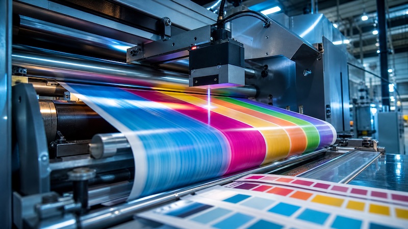
Achieving that consistency was a headache for decades. The same design can be printed by offset, flexography, gravure or digital, on board, plastic or film, and every combination of process, ink and substrate shifts the color. The good news is that technology now offers concrete answers:
- Extended color gamut (ECG): orange, green and violet are added to the four CMYK inks. With seven inks, more than 90% of the Pantone gamut is reproduced, compared with about 60% with CMYK. Spot-ink inventory also shrinks, saving cleaning time and waste.
- Closed-loop color control: systems that measure color in line and adjust each printing unit automatically until the specified Delta E is reached, without relying on the eye or the operator’s experience.
- Digital validation: the print becomes a “digital twin” that the brand owner compares with the original file. No more guesswork.
- Simulation from the design stage: the designer knows from the start which colors are achievable on each substrate and avoids surprises on press.
The industry sums up this change in a phrase worth remembering: printing is moving from an art to a science. For product personality, this means that the designed character can finally be guaranteed to be the same in Bogotá, Mexico City and Madrid.
So, does everything depend on color?
Almost everything. Color does not replace a good product, a functional structure or clear, honest information. But it is the element that opens the door: it decides whether the consumer stops, what they expect to find and whether they trust what they see. It is the first sentence of the conversation between brand and shopper, and if that sentence fails, the rest of the speech goes unheard.
Good color in packaging performs five tasks at once: it attracts in fractions of a second, anticipates the senses the shopper cannot use in the store, identifies the category and the variety, builds a personality coherent with the brand and stays identical in every unit that reaches the shelf. When all five are met, the package stops being a wrapper and becomes the product’s best salesperson: one that works all day, in silence, and does not need to say a single word.
Frequently Asked Questions
Why is color so important in packaging?
Because it is the first thing consumers perceive and the one they process fastest. It is estimated that up to 85% of the first impression of a product is based on color, and the decision in front of the shelf takes about two seconds.
What is product personality?
It is the set of traits consumers attribute to a product: serious or cheerful, natural or technical, economical or premium. Packaging, and especially its color, is the main driver of that impression.
What is the relationship between sensory marketing and color?
In the store, shoppers can only use sight. Color translates sensations such as taste, aroma or texture into visual terms, letting them “try” the product with their eyes.
Which colors are most visible on the shelf?
In order of visibility: yellow, orange, red and green. Blue is pleasant but less visible.
How can you guarantee the packaging color is always the same?
With measured color management: printing with extended color gamut (ECG), closed-loop color control during printing and digital validation of the print against the original file.
Learn in depth how color builds the personality of your product in the
INTERNATIONAL DIPLOMA in Packaging, Containers and Shipping Packaging (Spanish)